The core concept of the campaign revolves around playful affection, togetherness, and protection, translating the playful side of motherhood into a light and warm tone. The term "Mãe Bicho" plays on popular expressions like "mother hen" or "lioness mother"—the kind of mom who cares, protects, and loves in an instinctive and deep-seated way, but wrapped in the lighthearted, humorous, and cute identity that defines the Puket universe.


O Key Visual foi construído com a tipografia principal da marca, a GT Maru Midi,
cujas formas arredondadas no título "MÃE BICHO" traduzem com perfeição a ludicidade,
o aconchego e o tom divertido da Puket.
A paleta de cores destaca um rosa vibrante no fundo, contrastando com o amarelo nas chamadas de ação. As fotos traduzem o afeto entre mãe e filha usando os produtos da coleção, apostando em uma iluminação viva e interações espontâneas que reforçam a conexão emocional da data.
Por fim, os elementos flutuantes das estrelas e o texto promocional
("Ganhe 01 brinde surpresa!") amarram o conceito visual, transmitindo a magia de presentear.
The Key Visual was built using the brand's primary typeface, GT Maru Midi, whose rounded shapes in the
"MÃE BICHO" title perfectly capture Puket’s playful, cozy, and fun tone. The color palette features a vibrant pink background, contrasting with yellow callouts. The photography highlights affection between mother and daughter wearing the collection, relying on bright lighting and natural interactions that reinforce the emotional connection of the date. Finally, floating sparkles and the promotional badge ("Na compra de 2 peças.") tie the visual concept together, delivering the magic of gift-giving.

Complementando a experiência digital, o trabalho de motion design traz vida às peças por meio de entradas rápidas e corrido na tipografia principal, pulsação em stop motion nas estrelas para atrair o olhar e transições das imagens da coleções despertando desejo nos produtos, garantindo que a oferta seja absorvida logo nos primeiros segundos de vídeo.
Complementing the digital experience, the motion design brings the assets to life through quick, continuous entrances on the main typography, stop-motion pulsing on the stars to catch the eye, and transitions featuring the collection's images to create product desire, ensuring the offer is absorbed within the very first seconds of the video.

A campanha não se limita às peças de vestuário; ela se estende à experiência de compra. A dinâmica de "comprou, ganhou um brinde surpresa" desperta a curiosidade e o sentimento de presente em dobro.
O brinde meias com rótulo e embalagem criadas exclusivamente para o dia das mães) fecha o ciclo do conceito, garantindo que o carinho e o espírito divertido da campanha acompanhem o cliente do site/loja física até a entrega do presente.
The campaign is not limited to apparel: it extends to the shopping experience itself. The "buy and get a surprise gift" mechanic sparks curiosity and the feeling of receiving a double gift. The gift (socks featuring labels and packaging created exclusively for Mother's Day) completes the concept's lifecycle, ensuring that the care and playful spirit of the campaign accompany the customer from the website or physical store all the way to the moment the gift is delivered.


MÃE BICHO
retail design, campaign, packaging design, social midia
Amanda Rodrigues | 2024
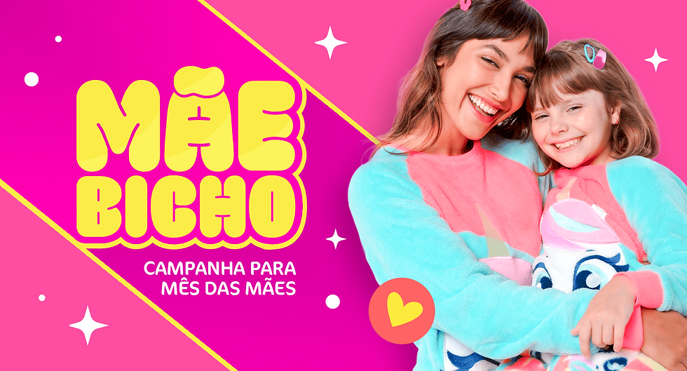
O conceito central da campanha gira em torno da afetividade divertida, cumplicidade e proteção, traduzindo o lado lúdico da maternidade em um tom leve e caloroso. O termo "Mãe Bicho" brinca com a expressão popular de "mãe coruja" ou "mãe leoa": aquela que cuida, protege e ama de forma instintiva e visceral, mas com a identidade leve, bem-humorada e fofa própria do universo Puket.